Purpose
The purpose of this plot is to display the original data w.r.t. time along with some additional informations.
Example of graphic
In the proposed example, the concentration for the warfarin data set is presented. 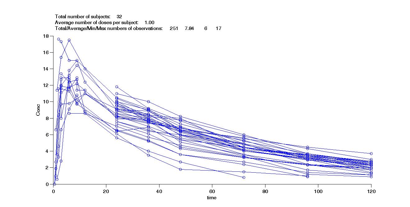
Settings
- Segments : Add/remove the segments between the observations,
- BLQ (with the color): Add/remove the segments between the observations
- Legend: Add/remove the legend (available only if there are several groups on the figure),
- Informations : Add/remove the informations on the measurements (total number of subjects, mean number of doses per subject, total, average, min and max number of observations)
By default, only Segments and Informations are activated.
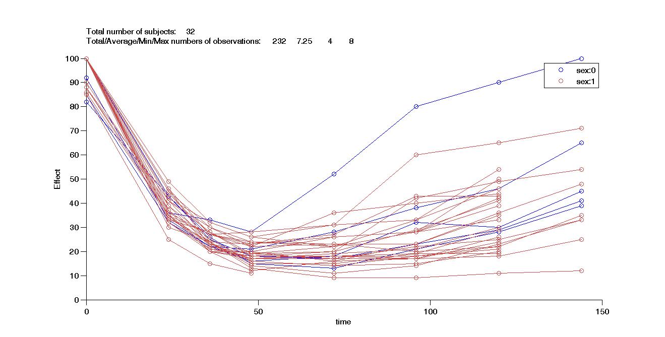
In the following example, we defined stratification by the category SEX for the effect on the warfarin data set. Additionally, the following settings are the default settings and the legend.
Best practices
- It is always good to have a look first at the Spaghetti plot before running the parameter estimation. Indeed, it is very convenient to see if all your data are ok, if something weird happens on a subject, …
- It is possible to see the Spaghetti plot just after loading the datas. For that, click on the icon next to the data file choice.
- For a better understanding and/or exploration of the data set, it is also possible to export the data set in Datxplore.