Purpose
This graphic displays the proportion of censored data w.r.t. time. It is possible to chose the censoring interval. This graphic is only available for projects with censored data.
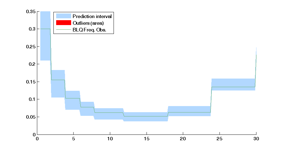
Example of graphic
In the following example, the parameters of a PKPD model (on the censored warfarin data set) are estimated. The figure presents the BLQ w.r.t. with the prediction interval.
Settings
- Display:
- Censored data min and max. By default, the limit and the censored values are used. However, one can look at smaller censored interval for example.
- BLQ Frequency observation calculated by simulation
- Median
- prediction interval with the associated level
- Outliers (area)
- Grid time size
- Legend
By default, the censored area corresponds to the data set description and the BLQ frequency observation, the prediction interval, the outliers and the legend are displayed.