What kind of plots can be generated by Monolix?
The list of graphics corresponds to all the graphics that Monolix can generate
Model summary and convergence
- Project summary
- Spaghetti plot: This graphic displays the original data w.r.t. time along with some additional informations.
- Convergence SAEM: This graphic displays the convergence of the estimated parameters with respect to the iteration number.
Diagnostic plot based on observed data
- Individual fits: This graphics displays the individual fits, using the population parameters with the individual covariates (red) and the individual parameters (green) w.r.t. time on a continuous grid.
- Obs. vs Pred: This graphic displays observations w.r.t. the predictions computed using the population parameters (on the left), and w.r.t. the individual parameters (on the right).
- Residuals: This graphic displays the PWRES (population weighted residuals), the IWRES (individual weighted residuals), and the NPDE (Normalized Prediction Distribution Errors) w.r.t. the time (on the top) and the prediction (bottom).
- VPC: This graphic displays the Visual Predictive Check.
- NPC: This graphic displays the numerical predictive check.
Diagnostic plots based on individual parameters
- Covariates: This graphic displays displays the estimators of the individual parameters in the Gaussian space (and those for random effects) w.r.t. the covariates.
- Parameters Distribution: This graphic displays the estimated population distributions of the individual parameters.
- Random Effects (boxplot): This graphic displays the distribution of the random effects with boxplots.
- Random Effects (joint dist.): This graphic displays scatter plots for each pairs of random effects.
Extensions
- BLQ: This graphic displays the proportion of censored data w.r.t. time.
- Prediction distribution: This graphic displays the prediction distribution.
- Categorized Data
- Time to Event data: This graphic displays the empiric (from observations) and theoretical (from simulations) survival function and average number of events for time to event data.
- Transition Probabilities: This figures displays the proportion of each category knowing the previous one for discrete models.
- Posterior distribution
- Contribution to likelihood: This graphic displays the contribution of each individual to the log-likelihood.
What can be done with the plots ?
The graphics menu bar proposes different options![]() It is possible to
It is possible to
- “Save as”, “Print”, “Close”, “CopyFigure” save, print, an close the figure and, in Windows, copy and paste it to any other document.
- “Zoom” menu activates or de-activates the zoom
- “Axes” menu proposes to use semi-log or log-log scale plots. Settings option gives the opportunity to choose labels and to change the scale of graphics. It is also possible to use the same axis limits for the different plots of the same graphic.
- “Stratify” menu opens the stratify window, see below.
- “Settings” menu opens a new window with the settings of the current graphic
How to stratify graphics ?
When clicking on the stratify menu, the following window pops up.
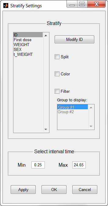 The Stratify menu allows to create and use covariates for stratification purposes. It is possible to select a categorical covariate for splitting, filtering or coloring the data set. Also, in the bottom section, it can be defined a time filter.
How to save the graphics ?
When clicking on the button “Outputs to save” in the interface, 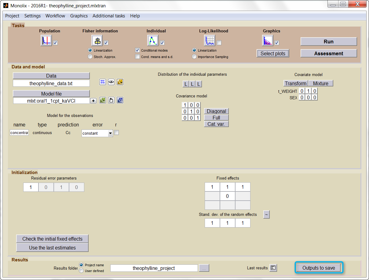 the following window pops up
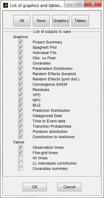
The user can choose which graphics to save. Notice that
- the save starts after the display of the graphics.
- the graphics are saved in the result folder.
- if the graphic is not defined by the user using the “Select plots” button, it will not be saved.